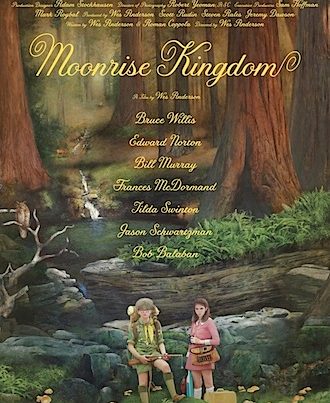
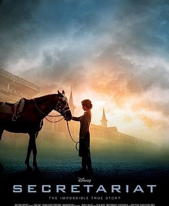
I use movie posters here to illustrate my reviews, not for aesthetic reasons for the most part, but to use as markers (so readers can easily find their way to the film they want to read about) and memory joggers (so readers can connect my ranting with the images they have seen in the media and at their local flicks).
Most posters don’t add aesthetic value because they are (mostly) bollocks – contractually obligated layouts with crappy photoshopping.
I wish we lived in a world where movies were promoted with design like this:
There are three more examples of posters from Dearden films at the Criterion Collection blog here. All wonderful.


Good call. I think the last one I can recall that made any kind of impression on me was Daniel Clowes’ illustrative poster for Todd Solondz’s “Happiness”. That was a looong time ago…
The limited edition Black Swan posters at least looked like someone had made a bit of an effort.
So, so true.
And of course who can forget these guys.
Have you seen the work of Olly Moss?
For the most part he has been doing a monthly feature reinterpreting modern posters for Empire UK or the Rolling Roadshow Tour. He’s started getting commissions from festivals and studios so hopefully one of the marketing departments will have enough faith in his work to unleash it on the public, soon … before we have more disasters like that god-awful photoshop jobbie for X‑men: First Class
I’ve mentioned Olly’s work here. The Die Hard is my favourite (because of my affection for the film mainly).
https://funeralsandsnakes.net/2010/09/21/august’s‑unsheets/
Damn right Dan. I write up films on my own blog and I always try and find (if bloody well possible) the best looking/most interesting/lovingly designed poster for a film. I’ve recently discovered http://www.reelizer.com which has a pretty good collection of posters from other designers.
But yeah, modern movie posters are pretty bollocks (just look at the recently release Pirates of the Caribbean posters – or to save your own eyeballs, don’t).
Take a gander at the wonderful movie poster re-imagining work at Reelizer, if you’ve not seen it before. Inventive and stylish stuff.
http://www.reelizer.com/
And somehow I’ve just stumbled across this collection of mad beauty:
http://50watts.com/1163606/The-Holy-Mountain-of-Contemporary-Polish-Posters
There’s a company called All City Media that does some cool stuff for their more ‘indie’ clients. Also, you should check these out: they’re the SXSW design finalists and some of them are amazing. Silver Bullet’s poster won.
Helps if I put the link in! http://www.flickr.com/photos/36242261@N04/sets/72157626251155972/