I don’t have much room this week and I want to spend most of it gushing over Slumdog Millionaire so let’s get started.
 Back in 2003, when the Incredibly Strange Film Festival was still its own bumptious stand-alone anarchic self, we opened the Festival with the summer camp spoof Wet Hot American Summer and goodness me, wasn’t that a time? Written and directed by David Wain, WHAS was a pitch-perfect tribute to teen comedies of the 80s and his new film Role Models attempts to ride the current wave of sexually frank grown-up comedies but he doesn’t seem to really have the heart for it. The gross-out bits are uncomfortably gross, the boobies seem like afterthoughts and the film really doesn’t hit its straps until it starts cheering for the underdog late in the day.
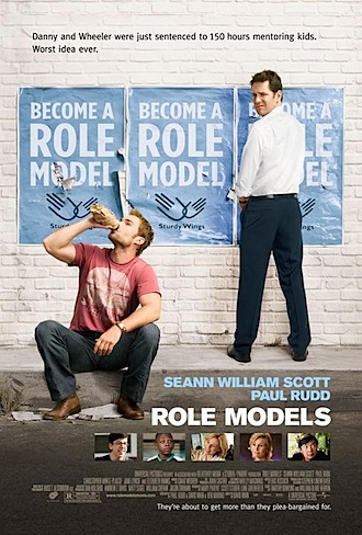
Paul Rudd and Seann William Scott play salesman peddling energy drink to high school kids. After an unfortunate (stationary) road rage incident their jail time is converted to community service at Sturdy Wings – a ‘big brother’ outfit matching misfit kids up with responsible male adults. This kind of material has proved outstandingly popular recently when produced by Judd Apatow (Knocked Up, Superbad, Forgetting Sarah Marshall) and I can’t help thinking that if he had gotten his hands on Role Models it would have about 20% more jokes in 16% shorter running time – he really is that much of a machine.
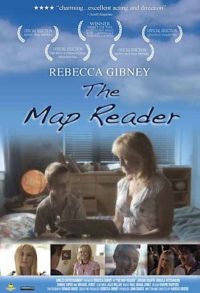 As micro-budget New Zealand features go, The Map Reader isn’t that bad. Set around the picturesque Kaipara Harbour, the film features Kiwi actor Rebecca Gibney (whose first film was another coming-of-age story, Among the Cinders in 1983, but she’s better known now as the star of Australian tv dramas like “Halifax f.p.”). Gibney plays the possibly alcoholic single mother of sensitive teenager Michael (Jordan Selwyn) who has been moping over maps and atlases since his pilot Dad left when he was a baby. Michael feels out of place in bogan Helensville and relationships with a flirty blind girl (Bonnie Soper) and a troubled classmate (Mikaila Hutchinson) force him to experience the real world first hand rather than through his beloved maps.
Director Harold Brodie (Orphans & Angels) is hampered by some weak performances from the non-pros and a lack of a considered visual style but he makes some interesting choices, none more successful than choosing a distinctive soundtrack from bluesman Paul Ubana Jones. [Ed: Harold Brodie jumped into the comments to make some clarifications. See below.]
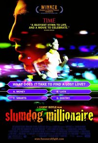 To Slumdog: I’ve been a fan of director Danny Boyle ever since his feature debut with Shallow Grave in 1995 and Trainspotting broke the mold (still referenced twelve years later). I love that he was a theatre director and yet has the visual panache of a music video maker. I love that none of his films resemble any of his other films. I love that none of his films resemble anybody else’s films either for that matter. I love that all of his films are flawed in some way but never fall short when it comes to heart. And I love the fact that he fills the screen with energy and trusts that the audience will take it all in.
Loosely based on a novel by Vikas Swarup, Slumdog Millionaire tells the rags to riches story of Jamal Malik, a good-hearted boy who works his way up from the slums of Bombay to a chance at wealth beyond his wildest dreams thanks to the Indian version of “Who Wants to be a Millionaire?” and the story of his life is structured around the ever-increasing tension in the game show itself.
So, we have a traditionally satisfying narrative told with extraordinary visual richness (a colour palette lifted straight from a sari shop window), boundless energy in camera movement, restive editing and a thrilling (and noisy) soundtrack by Bollywood legend A.R. Rahman – we’ve waited a while for it, but Slumdog Millionaire feels like the first film of the 21st century.
Printed in Wellington’s Capital Times on Wednesday 4 February, 2009.
Nature of conflict: The Map Reader is an Arkles Entertainment production and release. I do a little work for Arkles every now and then. 1st AD on The Map Reader is the great Jeremy Anderson, an old friend.
Notes on screening conditions: Role Models got the usual more than acceptable presentation at Readings Courtenay Central; The Map Reader was screened on a watermarked DVD courtesy of the distributor; and Slumdog Millionaire was simply awesome at the Embassy.

I disagree with your review of “Role Models” which I thought was funnier (and more joke filled) then any Judd Apatow movie. I’m particularly confused by your assertion that if Judd Apatow had produced Role Models it would have been “16% shorter running time”. In fact Role Models is WAY shorter than ANY of the Judd Apatow comedies (and for my money way better paced):
Superbad: 1 hr, 54 min
Forgetting Sarah Marshall: 1 hr, 51 min
40 Yr Old Virgin: 1 hr, 56 min
Knocked Up: 2 hrs, 9 min
Role Models: 1 hr, 35 min
How short a movie ‘feels’ is way more important than how short it actually is. For me, Role Models felt flabby with long unfunny improv sections (Jane Lynch’s bits being particularly repetitive). Listening to screenwriters Wain and Marino on the Creative Screenwriting podcast confirmed a lot of what I thought at the time – gags were left in for self-indulgence reasons, improv was used a lot to cover big gaps in the script and they had to re-shoot a quarter of it (including adding more topless bits).
Re The Map Reader, I’m wondering what you mean by “lack of considered visual style” since many other reviews comment on the beautiful visuals. This 200K NZ film has been in competition at many highly reputable international film festivals up against films costing millions, and it has more than held its own visually. Also, to which “non-pro” actors are your referring?
Firstly, Harold, thanks for stopping by. (Harold is the director of The Map Reader, reviewed above) I thought your film was very well photographed with quality DI and some lovely colours – a quality effort that certainly doesn’t signal a low budget. But photography alone is not a visual style. The rest of the elements (composition, framing, movement, etc) I thought were honest but ordinary – good television but not cinema. And I thought all the performances apart from the two leads were fussy – too much stuff going on.
Regards composition etc., it was a very conscious choice to present the material in a straightforward way that accentuated the actors and their characters within the story. We felt that if we had compositions that were too consciously framed, the audience would be paying attention to these elements, and not getting drawn into the film like we wanted. You may not agree with that approach, but I think it’s important to note that it is just as “considered” as other approaches. That said, we would choose other times in the film where these elements were bolder, as in the final sequence with the kite. There, hopefully, the contrast of that filming style to the style seen previously would help tell the story in a different way. Regards the actors, you are certainly entitled to your opinion, but the “non-pro” tag threw me. Aside from the smallest of parts, those actors all have agents and are working.
Thanks for the clarification (of both points). With hindsight, “non-pro” was unfortunate shorthand and I withdraw it.