Over the last couple of weeks both the Penthouse and the Paramount have upgraded their websites – the Penthouse scores marks for having their session grid available only a click away from the front page and the Paramount scores bonus marks for having the session grid right there on the front page – no extra clicking.
Paramount loses serious marks because the film titles aren’t clickable! You have to go to another menu to read about the films. Counter-intuitive, dudes.
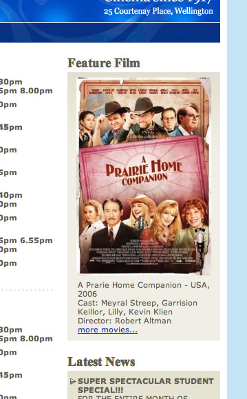
My favourite aspect (in a schadenfreude-y sort of way) of the Paramount’s new design is the lack of attention to detail, as displayed in the following image (snapped today, may have been fixed by the time you get there but it has been like that for more than three weeks):

Notice how they manage to mis-spell the title of the film and all the members of the cast. Re-spect to Altman, though, as they got him right.
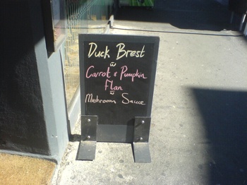
To prove that I’m not picking on them, here are a couple of choice Wellington chalk-typos. The first from a couple of weeks ago outside <forget the name, on the corner of Cuba and Vivian>:
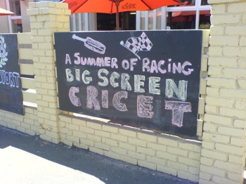
And my favourite, from outside The Caledonian last Summer (the blackboards and fences have since been taken down by the new management):


